May 1, 2026
Opinions
Opinions
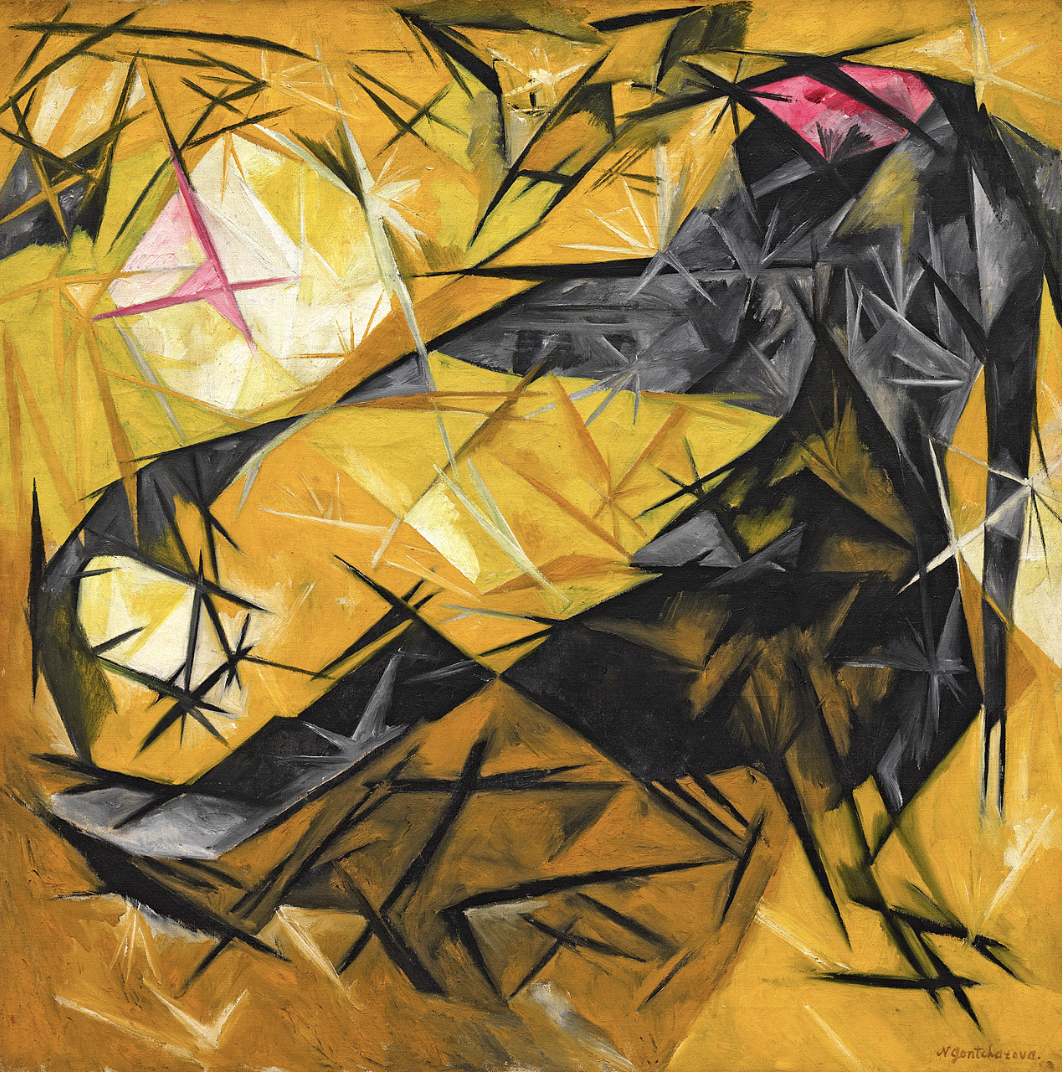
Cara explores how Natalia Goncharova redirects the ambitious, often technologically oriented rhetoric of Russian avant-garde abstraction toward an intimate and playful subject: domestic cats.

A discussion of the collaboration between Sonia Delaunay and Blaise Cendrars, exploring how literal and visual materials merge into each other to create a timeless narrative.


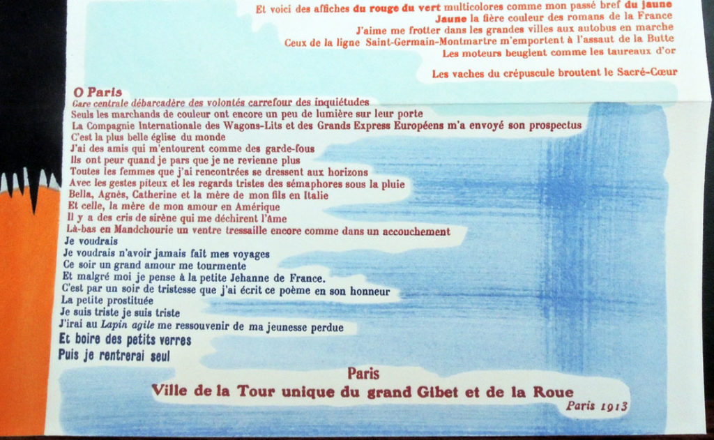
Prose on the Trans-Siberian Railway and of Little Jehanne of France is a collaboration between French artist Sonia Delaunay and Swiss-born novelist and poet Blaise Cendrars. The work is divided into two vertical portions, with Delaunay’s illustration on the left and Cendrars’ poem on the right. Delaunay’s work is in the style of Orphism, or Orphic Cubism, where artists focus on abstraction of pure color, light, and representation. Next to Delaunay’s illustration, Cendrars’ poem then provides a semi-autobiography of a young poet’s travel experience. The story happened on the Trans-Siberian railway, the longest railway in the world. Although divided on the page and two contrasting mediums, the work as a whole conveys a total narrative. The abstraction of light within Delauney’s portion is a psychological capture of the traveling experience: the overflowing of color creates an incessant observation and attraction, which much resembles the landscape outside the windows layering up and entering each other under the motion of the train. The audiences are therefore brought into a frameless psychological realm in which the abundance of color directs and re-directs their attention to different moments, urging them to experience a flow of visuality and thoughts, and eventually challenge their perception limits.
This interdisciplinary collaboration perfectly combines the aesthetic core of the two artists and simultaneously boosts the effects of both sides. The poem changes color and font as it proceeds, while the watercolor painting permeates and condenses itself into color blocks, drifting into the poetic narration, also representing the physical location where the traveler locates himself. However, the color blocks at some points confusingly disappear into each other, creating unexpected linebreaks– they thus become subtle signs of dislocation and erasure, corresponding to the erratic rhythm of the poem. In a sense, the visual techniques speak in their own complex voices, serving as extensions of the literal meanings.

The fluid form of this work, which both possesses completeness and fragmentation visually and literally, eventually has a secretive concrete and modern symbol. The original intention of the artists was to print 150 copies, which will have a total length of the same height as the Eiffel Tower–a beacon of modernity in the early 20th century. Although there were only 6 copies produced eventually, the idea of extracting the entire travel experience into a specific landmark was impressive. It not only corresponds to the depiction of Paris in the first section of the poem, but also a distortion of location and amputation of time that the poet and audiences experienced while traveling in the train, or through the work. The folding and stretching of the copies, the abstract illustration of the Eiffel Tower, and the map on the top of the work, are all creating a condensed geography, which turns the sociocultural notion of space-time into a subjective arrangement of personal history and intimate movements.
The simultaneous effect of the illustration and the poem in this work brings audiences from the visual and literal abundance to the subliminal experience of traveling. Therefore, this work will never become flat on its own: audiences take in the thrilling experience in the reading of the poem, bringing the significance of this work to a modern narrative in their re-production. In 2008, a facsimile, with full-sized color and original folding, was produced by the Beinecke Rare Book and Manuscript Library. However, it did not reflect the pochoir printing technique of the original. Pochoir is the french word for stencil, which is a process of adding inks to plates and layering colors up by pressing the plates to each other. Skillful artists play around with details like gradations, stippling, and spattering. The absence of gradation in this version flattened the hidden narratives of the illustration. While the separated color blocks enhanced visual significance, they failed to convey the interconnected spaces of train travel that created a condensed geography, or align with the poetic narrative blending decentered childhood memories with movements.
In 2018, a better version with the same size, same color, and same folding as the original was recreated by Kitty Maryatt, Director Emerita of the Scripps College Press. Producing 150 full copies, this recreation finally breathes life into Cendrars and Delaunay's century-old vision, stretching time and endowing the work with renewed significance.

(Cover Image: WikiArt)
Cara explores how Natalia Goncharova redirects the ambitious, often technologically oriented rhetoric of Russian avant-garde abstraction toward an intimate and playful subject: domestic cats.
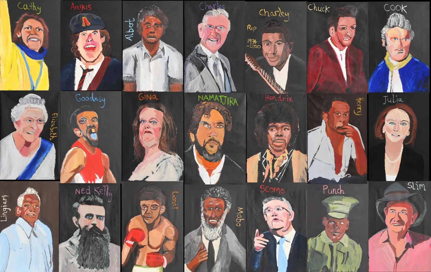
Kate explores how Australian artist Vincent Namatjira redefines portraiture to confront the legacies of colonialism while envisioning a more inclusive future—one expansive enough to embrace all Australians.

Clarke Reynolds (Mr. Dot) talks with the Art Review about interactive art, changing the narrative around blindness, and creating a world where art is more accessible for all.