May 1, 2026
Opinions
Opinions
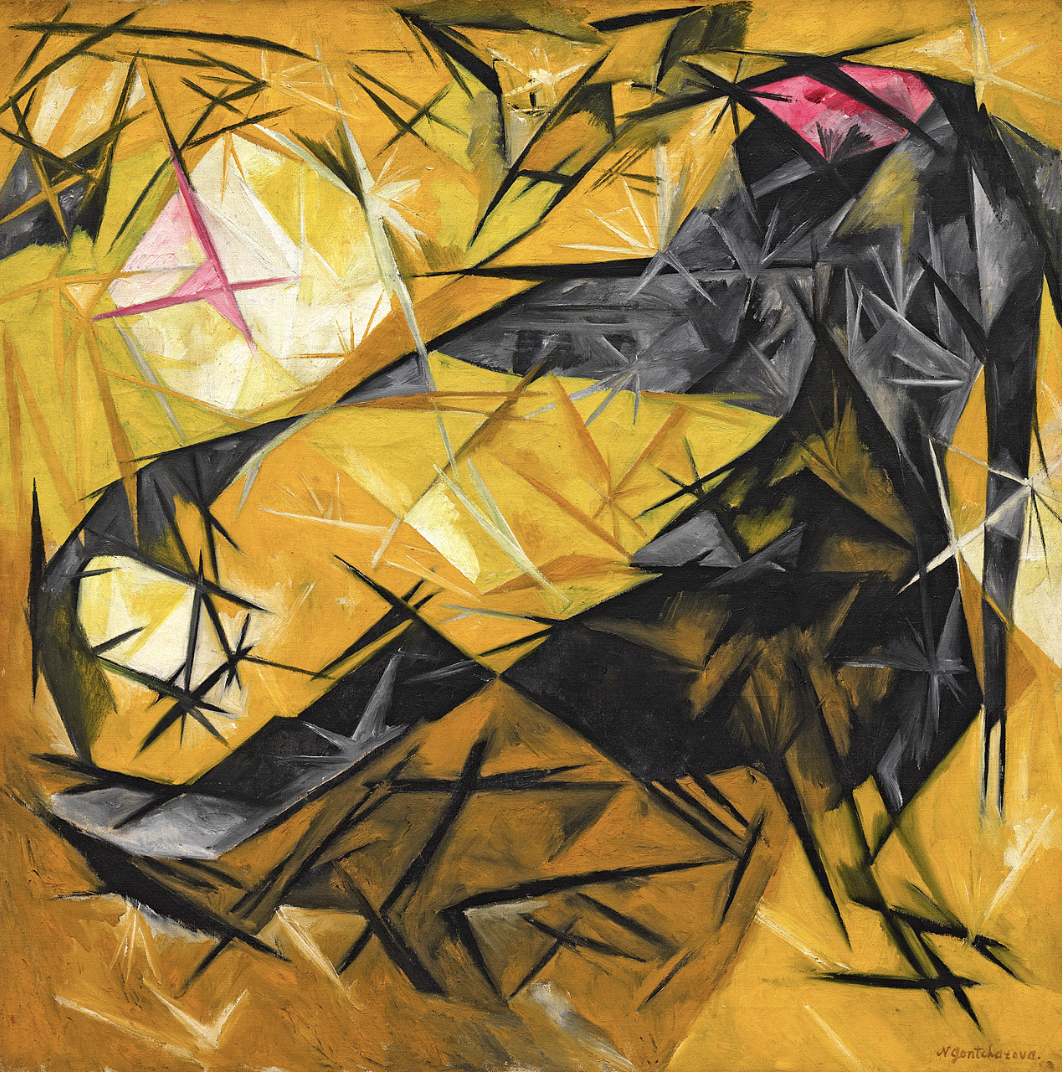
Cara explores how Natalia Goncharova redirects the ambitious, often technologically oriented rhetoric of Russian avant-garde abstraction toward an intimate and playful subject: domestic cats.

Adam examines the perceptual relationships between color depictions in the Pre-Raphaelite movement and in the Technicolor and Eastmancolor forms of early color film, focusing on the experiential and the desire to depict the true.


When viewing Victor Fleming’s The Wizard of Oz (1939) and Millais’s 1848-1849 Isabella, one becomes adrift in a sea of color, bathed by a nostalgic brightness that reaches into the very depths of youthful experience. This centrality of striking color links these pieces in form, but also causes one of the most major impacts for the modern viewer: an imagined luminosity of the past, the lost, and perhaps the truth of childhood experience. The power of color to take hold of an individual presents itself in these and related works, but similarity in aesthetic experience does not denote actual intent. The Pre-Raphaelites often used color as a means of accessing a lost moral, visual, and naturalistic truth of the medieval era, found in its artistic ability to depict a serious reality. In this way, they are similar to the Realists in intent, but separated in form and often narrative sources. The Technicolor and Eastmancolor processes were used for a wide array of films, but are often associated with the fantastical and the imagined. How do the color processes and the intent behind their use compare in these movements of paint and film, especially since the Pre-Raphaelite style was based on largely shared artistic ideals? Does this bright sense of color need a resurgence in modern art and film? Can all differences of purpose in narrative and moral direction be rectified to extract the sensory experience of the color and its connotations?
The Pre-Raphaelite Brotherhood was a group of artists from the mid-19th century consisting of William Holman Hunt, John Everett Millais, Dante Gabriel Rossetti, William Michael Rossetti, James Collinson, Frederic George Stephens, and Thomas Woolner. The Brotherhood also drew on, influenced, and coexisted with related artists, such as William Morris, Ford Maddox Brown, John William Waterhouse, and Julia Margaret Cameron (some of whom are considered to be stylistically Pre-Raphaelite in the broader sense of the artistic movement, outside of the sole Brotherhood). The group exhibited modernism in its naturalistic tendencies along with its desire for truth without academic conventions. At the same time, however, the group found reality in past (particularly medieval) tales, coloric conventions (blocks of color, typically), and modes of bodily depiction (sharp bodily forms without a blended and idealized style); this seeming separation was united in the desire for the truthful and real, found in these pre-Raphaelite traditions.
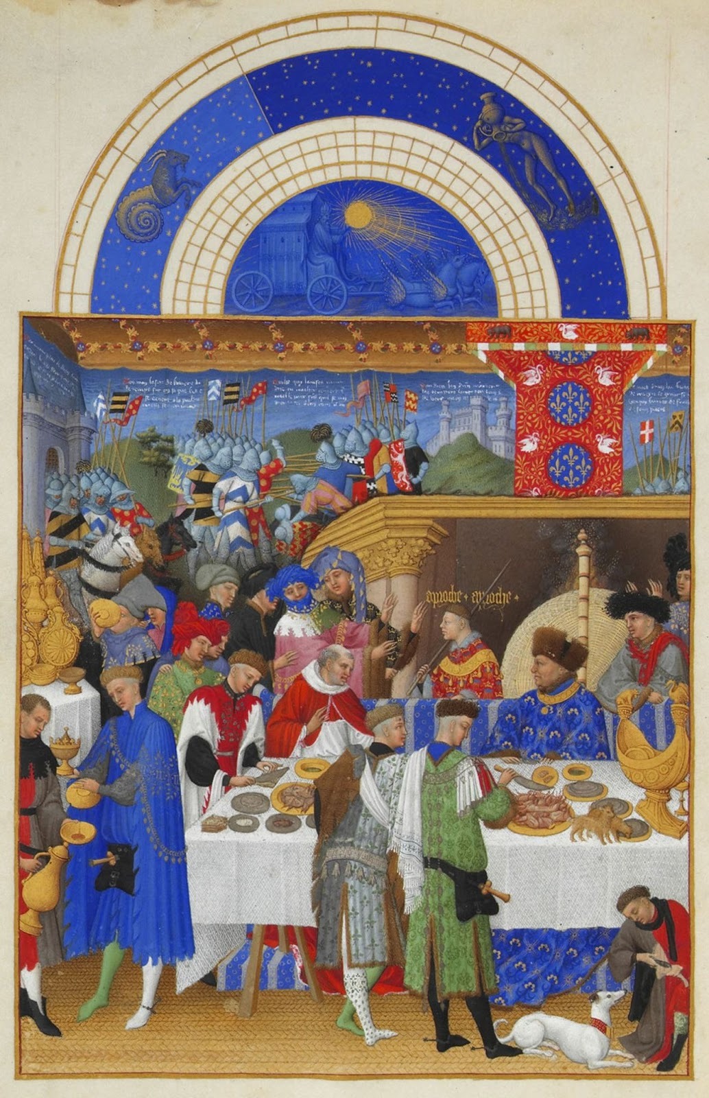
To illustrate these influences, particularly of color, I would like to point to the January feast scene of the Très Riches Heures du Duc de Berry by the Limbourg brothers. A comparison to Millais’s Isabella feast scene is clear: the bodies are posed and engaged, angled toward their purposes. A sense of prosperity and noble chivalry is prioritized through the wealth of garments and the military scene of the background. In the midground, the patron (Jean de Barry) is included as a form of portraiture. His involvement in the scene (a family affair) is stressed. Patterns reminiscent of the Pre-Raphaelite forms are shown through the various decorative motifs (clothing and standards). Rich, deep colors burst out from the scene, bringing life and, for the Pre-Raphaelites, reality to that which is depicted. The wash of blues strikes the viewer with a recognition of nobility, complimented by the reds, greens, and golds that one can almost texturize. Through this piece, one can see the stylistic influences of the medieval on the Pre-Raphaelites, who evoked both the coloric and compositional qualities of works such as this.
The Brotherhood sought to depict events naturally, as they would have been viewed (with particular emphasis on vegetation and facial individuality). For color, this meant a revival of the typically medieval sharpness, brightness, and clarity within blocks. The process of painting for the Brotherhood involved “an equal focus on all parts of the composition, painting backgrounds first and figures later, all from life. This is what gives their paintings a discordant quality of focus - rather like a high definition film.” This development of a work with equal respect to vegetal and figural representations presents a reasoning for the persistent use of equally bright color: truthfulness to the clarity of actual scenic viewership and the influence of the moral, true medieval works.
So, what makes the Brotherhood’s colors pop? How do they capture this sense of the medieval and the equal? Libby Sheldon (University College London) examined how Millais’s “whole painting procedure follows the systematic approach of a mediaeval artist - both in fresco and on panel - working on one area at a time.” It is important to note that, irrespective of materiality and layering, members of the Brotherhood embraced the working practices of their medieval muses. Sheldon continues by commenting on how the greens of the Brotherhood “were produced by mixtures of new, translucent, acidic-yellow pigments, based on barium and strontium chromates, together with translucent blues, Prussian blue (a greenish blue) and French ultramarine, laid on a perfectly white ground.” Here, one gets a sense of the peculiar blend of the modern and the past in the use of color. By using modern synthetic pigments like Prussian blue within a traditional layering process of color over white, the Pre-Raphaelites were living out their artistic pursuit of truth, naturalism, and the moral medieval style.
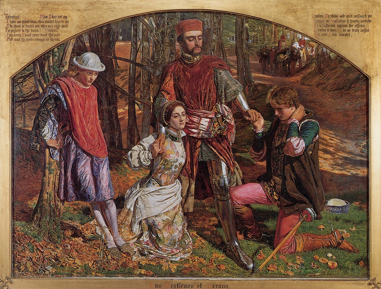
Now, I would like to transition to the felt, the experienced, and the narrative of the Pre-Raphaelites through William Holman Hunt’s 1851 Valentine Rescuing Sylvia from Proteus. The narrative of the piece comes from Shakespeare’s comic play The Two Gentlemen of Verona, in which Valentine, the lover of Sylvia, saves her from Proteus, Valentine’s friend, while Julia, the lover of Proteus, watches in disguise. This is the text associated with the image:
PROTEUS. I’ll force thee yield to my desire.
VALENTINE. [advancing]/Ruffian, let go that rude uncivil touch,/Thou friend of an ill
fashion.
PROTEUS. Valentine!
VALENTINE. Thou common friend, that’s without faith or love,/For such is a friend now. Treacherous man,/Thou hast beguiled my hopes; nought but mine eye/Could have persuaded me. Now I dare not say/I have one friend alive; thou wouldst disprove me./Who should be trusted when one’s right hand/Is perjured to the bosom? Proteus,/I am sorry I must never trust thee more,/But count the world a stranger for thy sake./The private wound is deepest. O, time most accursed,/’Mongst all foes that a friend should be the worst!
PROTEUS. My shame and guilt confounds me./Forgive me, Valentine. If hearty
sorrow/Be a sufficient ransom for offense,/I tender ’t here. I do as truly suffer/As e’er I did commit.
VALENTINE. Then I am paid,/And once again I do receive thee honest./Who by
repentance is not satisfied/Is nor of heaven nor Earth, for these are pleased;/By penitence th’ Eternal’s wrath’s appeased./And that my love may appear plain and free,/All that was mine in Sylvia I give thee.
JULIA. [aside]/O me unhappy!
The piece transforms the literature into the visual, the colorful, the experiential. When viewing the piece, one is drawn toward the composition, the gestures and the holds, the faces and the distance. Valentine, Sylvia, and Proteus are drawn together while Julia is separated. There is a physical connection between Valentine, Proteus, and Sylvia, but there is a sense of elevated proximity in the compositional relationship of Valentine and Sylvia. The emotions on the faces of the figures display overwhelm for Julia, distaste, yet mercy, for Valentine, shame for Proteus, and perhaps confidence or gratefulness in security for Sylvia. One feels that they are regarding the scene as if in a memory or a story book. This comfortable distance is inviting, yet separating. One is within the story, yet one is also relegated to a position of mere viewership. All of these compositional components are supported by color. The vivid greens of the grass, the contrasting pinks of Proteus, and the decaying, bruised purplish blue of the heart-broken Julia. The orange wash of detailed leaves envelops the piece and pushes the viewer toward the background. The characters exist in the environment, and the environment exists for them. The viewer, living in this brightness of memory and truth, experiences the scene as a viewed image rather than sole words or thoughts. They link the color to their past experiences, the memorial wash of colors that once filled their senses, a childlike wonder that was once accessed; can this derivative association be reconciled with the full reality and intent of the work? I believe so. One can realize the aim of the realistic application of color and vividness while also feeling the brightness of color personally, linking it to the stylistic experience and its vivid nostalgic qualities.
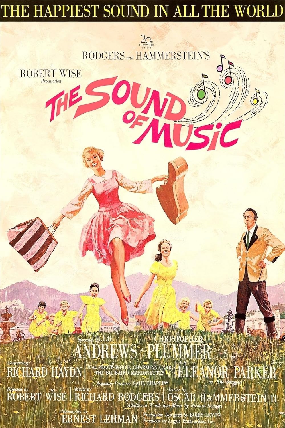
Early color film portrays color with a similar brightness and clarity as the Pre-Raphaelites. Many of these films used Technicolor, a dye-transfer process that revolutionized how films were viewed with luminous color capabilities. Eastmancolor was eventually developed, preferable because of its cheaper single-strip nature rather than the two-color then three-strip natures of the earlier Technicolor (although the Technicolor company did create its form of Eastmancolor technology eventually). For the purposes of this article, I will be speaking of the qualities of color in the various technologies of early Technicolor and Eastmancolor jointly, as they both share the similar sense of brightness, luminosity, and nostalgia-inspiration. In the discussion of the utility of Technicolor, I believe that the film historian Richard W. Haines captured it best when he claimed that works advertised as “Glorious Technicolor,” while not offering “a realistic depiction of colour, … were aesthetically pleasing and entertaining to watch.” As with the colors of the Pre-Raphaelites, the brightness of Technicolor, and later Eastmancolor, promotes a sense of memory, experience, nostalgia, and overwhelming satisfaction. Technicolor was also similar to the Pre-Raphaelites in its contemporary rejection. Haines goes on to comment on how “[s]ome cinematographers opted for a more realistic colour design … Victor Milner and William V. Skall’s photography on Reap the Wild Wind (1942) avoided garish primary colours but retained the saturation and contrast.” While I certainly disagree with Haines on the description of Technicolor’s palette as garish (a similar charge has been leveled against the Brotherhood; the art historian Tim Barringer, in his book Reading the Pre-Raphaelites, describes the colors of the costumes in Hunt’s Valentine Rescuing Sylvia from Proteus as “brilliant to the point of garishness”), I do believe that this statement brings up a good point: the artistic approach to realism. While the bright Pre-Raphaelite colors were utilized to evoke a sense of the true and the experienced, as well as to highlight actual viewership and medieval influence, Technicolor seems to be colloquially associated with the imagined, the fantastical, or the theatrical. However, this colloquial association does not denote intention; some filmmakers, like the Pre-Raphaelites, certainly saw in this brightness a means of accessing a serious reality. One could look to Robert Wise’s The Sound of Music. In this film, the richness of the colors contributes to the sense of innocence of the children and their youthful experiences. The color works as a means of expressing the robbery of this innocence in the escape of the family during the Anschluss, the tragedy of the disruption of the childlike reality. As was previously mentioned, the Brotherhood itself faced opposition for its “garishness,” thus exemplifying how the idea of viewers, critics, and even artists that bright color can only difficultly depict seriousness does not prohibit or nullify the views of those like the Pre-Raphaelites, seeing bright colors as one of the primary means of accessing reality.
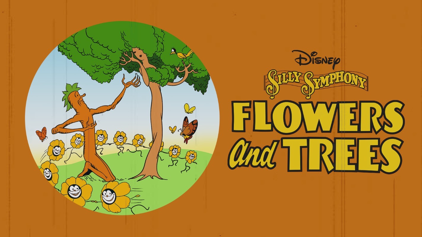
Now, I would like to analyze an early Technicolor source, similarly engaging its aspects of color for the felt, remembered, and perhaps the true. I have chosen to focus on Burton F. Gillett’s Flowers and Trees, the first commercial film to use Technicolor’s three-strip process after the two-color form that preceded it. The short film is whimsical and fun, while also capturing some very pertinent insights on the experience of color. I find the backgrounds to be especially striking. There is a clear sense of the accentuation of the actors in the foreground, a large difference from the general Pre-Raphaelite style (although perhaps due to the laborious animation process, also). The fire that emerges later on in the short floods the screen, consuming and waving, with striking shades or red and orange. The short follows a moralizing tale of three trees, two male and one female. One of the male trees saves the female tree from the other male tree, thus leading to the response of the malicious tree, who attempts to burn the male tree who has saved the female tree. The short ends with the male tree who has saved the female tree proposing, and the trees seemingly live happily ever after. It is a simple, nostalgic tale that is seemingly fitting for the accompanying music and the colors present. Like the Pre-Raphaelites, color here seems to be used as a means of distributing the moral, the truthful. This simplicity is not the standard for all Technicolor works, but the example can point to the ability of Technicolor to similarly seek truth through brightness and clarity. The short is beautifully rendered in its skillfully cartoonish style and, as with the similarly bright works of the Pre-Raphaelite Brotherhood, I find myself becoming absorbed into the color, transported to a world of memory and nostalgia. The portrayal is exaggerated in its personification of the natural, but it seems to at least share the realistic desire to depict truth visually, even if it is not a naturalistic work in its subject matter like those of the Pre-Raphaelites.
Both the works of the circle of the Pre-Raphaelite Brotherhood and those stemming from color processes like Technicolor and Eastmancolor are strikingly bright and luminous. This brightness is, for the Pre-Raphaelites, informed by a sense of the true, the medieval, and the viewed. For the works of Technicolor and Eastmancolor, however, brightness is often associated with the fantastical, colloquially separated from the realist. Need this separation be definitively made? Both the theatrical, cartoonish, or fantastical and the definitely naturalistic can share in their desire to present a moral and experiential reality through color and narrative.
There seems to be some level of association between bright colors and simple narratives, perhaps influenced by the brightness of cartoons like Flowers and Trees. Does this need to be the case? Maybe brightness should again serve in films with narratorial complexity; in this way, the colors would nostalgize and memorialize the work. This is certainly the historical precedent for less fantastical works like The Sound of Music: truth is presented, aided by the wash of resplendent color that draws the viewer toward the past, the felt, and the seen.
There appears to be a movement toward increased color brightness in some spheres online. Many individuals complain about the dullness of modern films. Is this because of an inherent sense of the capability of bright color to capture truth? Moving forward, should films become more colorful? Regardless of whether this choice is made or not, the ability of brightness to portray the felt and the nostalgic, and reality within these, is applicable to the process of art and film analysis. Whether in viewing a Pre-Raphaelite painting or an Eastmancolor film, serious or unserious, one will bring their own associations with the brightness of color into the viewing. Despite the intentions of the piece, viewers will access a nostalgic and memorial reality through the use of colors, even to the extent of separation from the artist’s narrative and thematic purposes of the piece. Perhaps a more open view should be offered toward what it means for a work to depict reality based on the ability of color, despite subject matter, to point toward the vividness of youth.
(Cover Image: John Everett Millais, Isabella, Oil on Canvas, Liverpool, Walker Art Gallery, 1848–1849, via Wikimedia Commons.)
Cara explores how Natalia Goncharova redirects the ambitious, often technologically oriented rhetoric of Russian avant-garde abstraction toward an intimate and playful subject: domestic cats.
Kate explores how Australian artist Vincent Namatjira redefines portraiture to confront the legacies of colonialism while envisioning a more inclusive future—one expansive enough to embrace all Australians.

Clarke Reynolds (Mr. Dot) talks with the Art Review about interactive art, changing the narrative around blindness, and creating a world where art is more accessible for all.